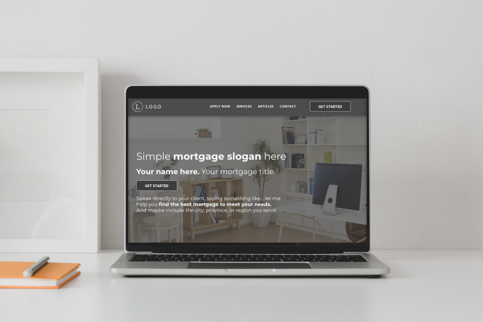
Essential Features of Website Navigation
Context note: As Deploy works primarily with Canadian Mortgage Professionals, this content has been written with that target audience in mind and published on Deploy.Mortgage, but we've shared it here as well as many of the concepts are transferrable to any business.
If you’re looking to provide a solid user experience for site visitors, it starts with a good website navigation system. The menu or site navigation should be intuitive and easy to use, allowing site visitors to find the information they want.
A good website navigation system will include the following features:
A primary call to action (CTA) button
A CTA button is a good idea for a website because it helps to guide users toward a specific action or goal you want them to take. A good CTA does precisely what it says. It calls people to action. Some examples of a good CTA would be:
- Apply Now
- Get Started
- Book a Call
- Start Here
- Contact Me/Us
Having a clear and prominent CTA button helps to increase the chances that users will take the desired action by making it easy for them to find and use.
Additionally, a primary CTA button helps to:
- Direct site visitors’ attention to the desired action
- Helps to increase conversions and sales by making it simple and easy for visitors to take the next step
- Allows site visitors to quickly know the website's main goal so they can decide if it is the action they want to take.
- It creates a sense of urgency and immediacy with the action it invites to
When designing a website, it is essential to consider the primary goal and effort that you want users to take and to make sure that the CTA button is prominently displayed on the page to make it as easy as possible for users to take that action.
Clear and consistent labelling
The labels used in the navigation should be clear and intuitive and should be used consistently throughout the website. Your menu should always be visible while the visitor is navigating your website. The exception is for squeeze pages or landing pages, where the goal is to force the user into a single option.
You should also add your company logo to the menu to help enforce your personal or company branding.
Organization and accessibility
The navigation should be organized logically and hierarchically, with main categories and subcategories distinguished. Drop-down menus for subcategories or pages nested under a category make site navigation considerably easier.
Your menu should be easily accessible from any page on the website in what is called a sticky-header menu. To help clients know where they are on your site, having active and hover states for links and buttons is a good idea.
Responsiveness is also important. The navigation should be responsive and adapt to different screen sizes, such as on mobile devices.
If you’re a Canadian mortgage professional looking to better your online presence by investing in a professional website,
please look at our subscription options here. It would be a pleasure to work with you!
MORE ARTICLES


